Over the past several years, the concept of intermarket relationships has gained in popularity. The analyses for these relationships are calculated using the comparison of one series against another, a good example being gold against the dollar. It is possible to derive useful indicators that take advantage of these relationships.
Working on the assumption that bear market bottoms in equities are preceded by a high in short-term interest rates, the adjusted series, which I call money flow, reverses direction ahead of the stock market. [Editor's note: The term money flow has been attached to a number of different analytical methods. As such, Pring's version of money flow should not be confused with Marc Chaikin's or with Laszlo Birinyi's money flow methods.] Conversely, because rising interest rates precede stock market peaks, the money flow rises more slowly as an equity peak is approached, later declining ahead of the market as the divisor -- the commercial paper yield -- grows.
This should work in theory, but Figure 1 shows that the leads and lags can sometimes be very subtle. For example, in 1982, the low in the money flow clearly preceded the low in the S&P Composite. However, in the majority of other occasions, the lead was extremely small at both peaks and troughs.
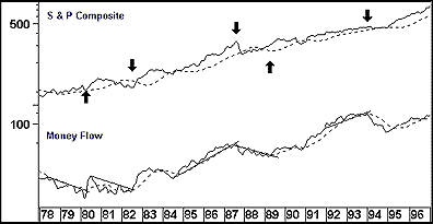
If you study the chart in Figure 1 more closely, it becomes evident that while the money flow sometimes coincides with the S&P at turning points, in most cases its rate of increase or decrease slows down sharply; the 1987 peak is a fine example.
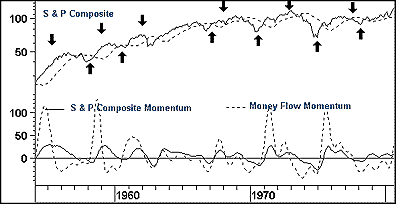
Instead, I suggest trying a momentum comparison. Figures 2 and 3 show a six-month moving average of a nine-month rate of change for both series. The theory behind using a momentum comparison is that the market is in a bullish mode as long as the money flow momentum is above that of the S&P, and vice versa. The arrows indicate the crossover points for buy and sell signals.
One of the basic rules of technical analysis is that no indicator is perfect, and the money flow is certainly no exception. However, over the course of time, it does offer reliable indications of primary trend reversals in equity prices.