I sn't it strange how an idea occurs? Being hit by a falling apple led Sir Isaac Newton to extrapolate that the apple was acted upon by the same force as that which allows the moon to orbit the Earth. Similarly, while I was doing research on price prediction, a thought came to me when I came across an illustration showing the measure of a head-and-shoulders formation. I wondered if there were a simple measuring technique to determine how far prices would fall once a trendline had been penetrated. In my quest to answer the question, I discovered a trendline formation that I call the bump-and-run reversal (BARR).
Before you can identify a bump-and-run reversal, you need to draw an upsloping trendline correctly. Rising trendlines connect the lows of a price series and represent an area of support. Suffice it to say that you locate the lowest low on the chart for the period being considered. From that point, draw a line to the highest minor low before the highest high without crossing any prices in between. The method is simple, repeatable and accurate.

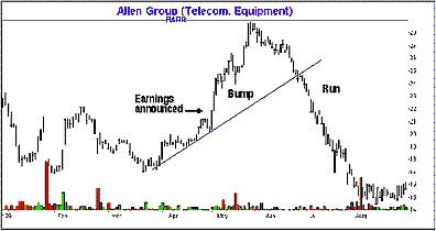
Once you're comfortable drawing upsloping trendlines, it's time to find a bump-and-run reversal. Figure 1 shows an example of a typical BARR in Allen Group [ALN]. I call it bump-and-run because of the characteristic bump at the formation's end followed by a downhill run.