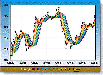
Repeated smoothing of data gives a spectrum of trends that, when plotted in color, have the appearance of a rainbow. Observe them all, pick your time frame, and act accordingly. The rainbow oscillator, a trend-following oscillator, is derived from a consensus of the trends.
Is there a pot of gold at the end of the rainbow? A fanciful and rhetorical question, but one that may in the final analysis have some truth. One approach to finding gold is momentum tracking and trend-following. Trend-following is a common, if not the most common, timing method used by traders and investors. In a perfect world, with smooth, continuous data, it would be easy to determine the direction of the price movement, open a position, hold it until the conditions change and then close the position. The underlying premise is that prices have momentum and inertia and will continue in the same direction until something occurs fundamentally to change that.
RECURSIVE SMOOTHING
Smoothing doesn't get much simpler than averaging two data points. For a time series of data, an average of each pair of points is about the most smoothing you can get with the least complexity. The smoother curve is a reference for the original time series and, to some degree, is a better representation of the prevailing conditions than the original data. But why stop there?
Average the average values again, two by two, and obtain an even smoother curve. Repeat this process over and over, averaging the previous average. Applying the same formula repeatedly is a recursive process, and the formula a recursion relation. The smoothing approach here is called recursive smoothing. Each smoother curve is a reference and filter for the less smooth curve. This process can be carried on ad infinitum, although generally there is a practical limitation or diminishing return.
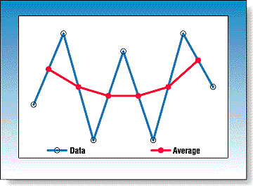
A graphical display of the two-point averaging and smoothing is shown in Figure 1. For a data series with typical variability, the two-point average is simply the midpoint between each of the data points. This process can be accomplished graphically, by hand, if desired. Connecting these averaged points with a line produces a smoother curve than the original data. In practice, the averaged values are not assigned to the midpoint of each period but to the later time to the right for each period. This results in the average lagging the data by half the period for a two-point average.

Figure 1: Two-Point Smoothing. The smoothed values are located at the midpoint of a line connecting each pair of data points.
