Perhaps no branch of knowledge has been as abused or misunderstood as statistics. Yet, without some grounding in basic statistical concepts, our ability to trade profitably is limited. Trading does not require a doctorate in mathematics, but mastering some basic fundamentals should help stack the odds in our favor. This is particularly helpful in developing an options trading strategy.
OPTIONS
Using Normal Distribution For Writing Options
by Mark Vakkur, MD
How can you go about selecting the best strike price for writing an option?
Many trading software packages automatically generate statistics on any tradable or indicator; often included are mean, median, and standard deviation. Although most people understand that a standard deviation is a measure of how volatile an asset is, beyond that, their understanding is fuzzy. Yet a wealth of information is buried in that number.
NORMAL DISTRIBUTION
To understand the standard deviation, you must first have some grasp of what the normal distribution is. Although entire academic careers have been devoted to arguing whether the market is random, if you were to graph the percentage change in the stock market over any period and then graph the frequency of each percentage change by interval as a histogram, you would get a bell curve. This bell curve conforms closely to what one would predict mathematically if the market were a random process with a slight upward bias.
For example, if you were to measure the four-week percentage change in the Standard & Poor's 100 index (OEX) for all rolling four-week periods (close of the last trading day of the week through the close of the last trading day of the next week) from October 1976 through December 1995, you would get a distribution with a mean of 0.7% and a standard deviation of 3.9%.
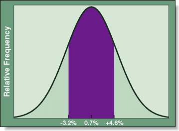
So what does this mean and how can it help us as traders? Well, the mean is simply the arithmetic average, or the sum of all the percentage changes divided by the total number of observations. The standard deviation is calculated by the spreadsheet but based on the amount that each observation differs from the mean. If you were to graph the number of observations (four-week periods) that fell between two percentage points (for example, zero and 0.1%) as a histogram or bar chart, the resulting graph (Figure 1) would form a bell curve with a peak at about 0.7% (between 0.6% and 0.7%, in this case) and most observations within one standard deviation from the mean (0.7% +/- 3.9% or -3.2% to 4.6%).
Excerpted from an article originally published in the December 1998 issue of Technical Analysis of STOCKS & COMMODITIES magazine. All rights reserved. © Copyright 1998, Technical Analysis, Inc.