INDICATORS
Keltner Channels
by Stuart Evens
There are many different ways of constructing channels, and one of the more basic, though less well-known, methods is the Keltner channel. Take a look.
The Keltner channel technique, which was first presented in 1960, is not generally as well known as other channel methods. In fact, while doing research for this article, I had a difficult time finding many references on the subject, and I personally have never used Keltner channels to trade. Therefore, I decided to get a feel for the Keltner method by comparing it to other, more widely used methods of channel construction.
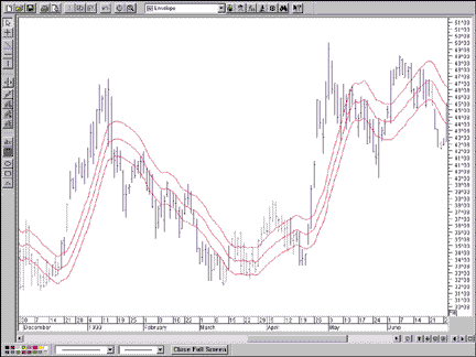
FIGURE 1: 3% ENVELOPES. Here are 3% envelopes applied to the daily bar chart for Apple Computer. During volatile price action, quite a bit of price is outside of the envelope.
I will first examine the basics of fixed-width envelopes, Bollinger Bands, STARC bands, and Keltner channels, going into more detail for Keltner. I'll look at how each method responds to the daily price bar activity for the same stock, Apple Computer [AAPL], during the same period. I'll then compare the historically backtested results for each of the methods applied to 23 stocks, chosen at random. I used MetaStock Professional for the backtesting and end-of-day data from Dial Data.
ENVELOPE THEORY
Moving average bands and channels all fall into the general category of envelopes, which consist of three lines -- a middle line and two outer lines. Envelope theory holds that price has the greatest probability of falling within the boundaries of the envelope. Price falling outside the envelope boundaries is considered an anomaly and therefore provides a trading opportunity. The major differences between envelope types can be found in the calculation of the lines, in the spacing between the lines or bandwidth, and how they are interpreted.
Figure 1 shows an envelope in its most basic form. The middle line is a simple moving average (SMA) of closing price, and the outer lines or bands are a fixed percentage of the moving average away from the center line. This example shows the daily chart for AAPL with a 14-day simple moving average, with 3% distance between each of the upper and lower bands. The bands are calculated as follows:
Upper band = 1.03*14-day SMA(close)
Middle band = 14-day SMA(close)
Lower band = 0.97*14-day SMA(close)
One theory is that when price touches or moves past the outer band, it is at an extreme and a reaction in the opposite direction can be expected. When at the upper band, price is said to be overbought, and when at the lower band, price is said to be oversold. However, even a quick glance at Figure 1 shows instances in which this is obviously not the case. This was one of the reasons for developing different methods of positioning the outer bands relative to the middle band, so as to be more accurate in indicating true price extremes.
Stuart Evens is a Staff Writer for STOCKS & COMMODITES.
Excerpted from an article originally published in the December 1999 issue of Technical Analysis of STOCKS & COMMODITIES magazine. All rights reserved. © Copyright 1999, Technical Analysis, Inc.
Return to December 1999 Contents