BASIC TECHNIQUES
Triangles And Trends
by Thom Hartle
Building positions is an essential exploitation of a successful trade, and triangle formations can be key to doing so.
The classic technical trader relies upon various chart formations for determining market tops, bottoms, and consolidations. Although the triangle chart formation can be a trend reversal or a consolidation, I want to show you how to use it as a continuation pattern, how to identify it as it develops, and how to trade it.
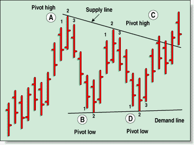
FIGURE 1: TRIANGLE. To draw a triangle, you need a supply line and a demand line. Use isolated highs and lows to determine the support and resistance points.
What are triangles? They are simply sideways trading action, with the widest part of the correction occurring earliest in the development of the pattern. As the market marks time, the trading range narrows, forming the shape of a triangle.
Why do triangles occur? According to the classic tome Profits In The Stock Market, by H.M. Gartley:
The most logical explanation appears that the period of formation of the triangle reflects an uncertain state of mind and a re-appraisal of the situation. During this time, all buyers and sellers are gradually influenced, by economic and statistical factors, to withdraw from the market. As a result, fluctuations narrow down and volume of trading diminishes until a new impetus affects the market. Prices often move out of this state of equilibrium as a result of news which is interpreted as important marketwise.
Triangles are easy to see in hindsight, but with a little quantification, I can define a technique to spot a triangle as it first develops. That way, you'll have the chance to trade the triangle as it's developing.
To outline a triangle, there are two trendlines to draw. The upper trendline, which is referred to the supply line, represents resistance. The supply line represents a lack of conviction by the buyers to commit more funds to the market, and because of that, there is enough profit-taking and short-selling to turn prices back down.
The lower trendline is the demand line and represents support. Here, the buyers come back out in force and turn prices up again. The key to drawing the correct trendlines is the use of a three-bar pattern referred to as isolated highs and lows. (See sidebar, "Isolated highs and lows.") These patterns are simply attempts by the market to move in one direction; the second bar's high is the highest point for the isolated high, and the second bar's low is the lowest point for the isolated low.
So when a market is in an uptrend, the first isolated high (Figure 1, point A) warns us that the upward trend may be stalling. That's just a warning. The first isolated high marks a momentary peak, and a countertrend move may follow. If the pullback occurs, I look for an isolated low (point B) to form during the decline. This isolated low will mark the completion of the first leg of the triangle. Here, the selling has waned enough that both new buyers and short-covering will push the market back up. After that, the market will advance again, but that won't take out the first isolated high. At that point, a second isolated high, lower than the first, unfolds; the supply line can then be drawn. This supply line can either be horizontal or declining.
Thom Hartle is vice president of Wizard on Wall Street, which offers a home study course for traders. He can be reached at 425 481-2582, via E-mail at Tbonds@halcyon.com, or at www.The-WOW.com/.
Excerpted from an article originally published in the February 2000 issue of Technical Analysis of STOCKS & COMMODITIES magazine. All rights reserved. © Copyright 2000, Technical Analysis, Inc.
Return to February 2000 Contents