3DSTOCKCHARTS.COM
Are you intrigued by the idea of viewing real-time stock prices in a three-dimensional display? Any trader would be, and so were we. We found this original approach at 3dstockcharts.com, which displays stock prices from Island ECN's order book in two-dimensional and three-dimensional formats. The 3D format is naturally the more interesting. Viewing the 3D charts requires a Java-enabled browser, so if you're without, you have to settle for the 2D display.
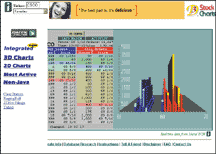
FIGURE 1: 3DSTOCKCHARTS.COM
You need to register to use the services available on this site, though it's free and only involves a minute of your time. Once you register, you will be taken to a Web page that lists the bids and offers on the Island book. A display of the 3D chart of the default stock is shown to the right of the orders (Figure 1). If you want the display to reflect details of another stock, just enter the Nasdaq symbol and hit enter.
The advantage of viewing a 3D chart is that it lets you visualize the ratio of buy and sell orders. The buy orders are displayed in blue and the sells in red. Anytime there is a reversal in the buy/sell ratio, you will see it almost instantly. Although the quotes are in real time, they only reflect orders on Island ECN. They do not display the bids and asks on the Nasdaq, so you don't get to see the institutional buying and selling.
You also have the option of viewing a two-dimensional chart that is similar to a bar graph. You can view the most active stocks on Island ECN in 2D.
The non-Java option gives you a 2D chart that doesn't update automatically; you need to hit the update button to refresh the screen. The Island most-actives are listed, and a click on any of them will bring up a chart of that stock. Links to popular Websites such as ClearStation, Raging Bull, Yahoo, and ZD Net are also available.
Beneath where you enter the ticker symbol, you'll find a pulldown menu that lists Websites relevant to the selected option. For example, if you select the "stock charts" option, you'll see links to Market Watch, Quicken, and ClearStation.
To expand its scope, 3dstockcharts.com is in the process of adding data from the Archipelago electronic communication network along with data from Island. This will give users the option of using multiple windows. As of this writing, a preview is available at the site.
The 3dstockcharts.com site can especially benefit traders who are placing orders on Island (and soon Archipelago), since its chart displays are based on those stock quotes. You can't place orders directly to Island through this Website, though, so you'll still go through your usual channels to place trades. What will attract Island traders -- or any trader -- to this site is the 3D charting displays, which are visually appealing and make it easy to determine whether the buyer or seller has control.
OUTERCURVEFINANCE.COM
While we're on the topic of alternative chart displays, heat maps may not be as popular as price charts or Level II screens, but they can reveal several factors about price activity in a stock. The home page of Outercurvefinance.com, formerly flextrader.com, displays a heat map on its home page (Figure 2) made up of squares, each one representing a specific stock. The color of the square reveals the degree of price change in the stock. The color scale is displayed along the bottom, with the deep red representing the highest degree of losses, and the deep blue, the highest degree of gains. Placing your mouse over any of these squares brings up a window that displays the best trading system based on the return on capital. Other details include open, close, last trade, change, day's range, and 52-week range.

FIGURE 2: OUTERCURVEFINANCE.COM (formerly Flextrader.com)
Users need to sign up to make use of all the available features, which are listed along the left-hand column of the home page.
Stock ranking is performed at the close of each trading day. Outercurvefinance.com's trading systems screen securities and rank them based on return on capital, capital preservation, percent of winning trades, and largest gains. The top 25 uptrending and downtrending stocks are displayed as heat maps. A similar strategy is applied to ranking the most overbought/oversold stocks, based on momentum bands, RSI, and stochastics. The stocks that meet your stock-screening criteria are shown in heat-map form.
If you click on the technical trading systems section, you can enter a stock symbol, select one of the listed trading systems, and enter the number of shares, the commission, number of calendar days, period performance, lookback period, oversold/overbought levels, and a trailing-stop value. Once you apply this system, you'll get a price bar chart with the indicators you selected. This is followed by data for the trading system, with details such as profit and loss periods, total return, average return, standard deviation of return, and Sharpe ratio. You will also see a trade log showing the dates the system signaled buys or sells and the resulting profits or losses. Various other reports displaying the effectiveness of the trading system will also be displayed.
Outercurvefinance.com also includes a learning center that walks a first-time user through all the features available on the site. As a registered user, you are part of the member community where you can post and reply to messages and pick hot stocks. Other features on the Website include news and analyst upgrades.
In general, the site provides valuable information to anyone involved in trading. With heat maps, you can view the performance of several different stocks with just one glimpse. The stock-screening feature and application of technical trading systems are valuable assets for any trader.
Originally published in the July 2000 issue of Technical Analysis of STOCKS & COMMODITIES magazine. All rights reserved. © Copyright 2000, Technical Analysis, Inc.