TRADING TECHNIQUES
Changing Your Market Perspective
Relative Performance Charting
by Phil Doyle
There's always a hot sector, but it's not always obvious where it is. Here's a quick, visual way to find it.
Relative performance charting compares the rate of price change of two or more tradable instruments. Its purpose is to point out what's hot and what's cold, so you can focus on the best action.
A broad range of names are applied to relative performance charts (RPC): relative strength charts, rebased charts, dollar-growth charts, and performance charts. They are all variations on the same theme. Although this methodology has long been popular among portfolio and money managers, it is only recently starting to gain popularity on trading floors, as traders discover that relative performance charts are well suited to short- as well as long-term trading horizons.

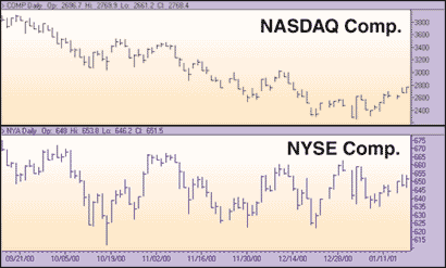
FIGURE 1: OVER AND UNDER. The simplest comparison puts two indices on separate panes in one chart.
THE BASICS
Starting with a very basic example, compare the performance of over-the-counter stocks to their listed brethren during late 2000 and early 2001. Start by using standard bar charts of the New York Stock Exchange (NYSE) and Nasdaq Composite indices to make the comparison (Figure 1). It doesn't take a skilled analyst to see that both indices are down over the period, and that the NYSE appears to have performed more strongly than the Nasdaq. Unfortunately, that's about all it tells us.
For a more definitive analysis, overlay the two indices, as in Figure 2. Add a ratio line (Figure 2) as a relative strength tool (not to be confused with the technical indicator known as Wilder's relative strength index, or RSI). The price of symbol 1 is divided by the price of symbol 2, with the result that the line will rise when symbol 1 is outperforming and fall when it is underperforming.
This technique is still untested as to the magnitude of the differing performance. A pure relative performance chart, such as the one in Figure 3, quantifies the difference. In addition to clearly showing that the divergence was far greater than it appeared from either of the other two charts, the scale on the right tells us precisely how much both indices have changed in percentage terms, as well as the amount of the divergence between them.
The concepts and math behind relative perfor-mance charts are extremely simple. The first datapoint in the price series becomes a zero, and all subsequent points refer back to it. Figure 4 shows a simple example using the first seven datapoints of the Nasdaq Composite, as depicted in Figure 3. (See also sidebar, "Creating relative performance charts in Excel.") As an example, period 2's value = (3726.5 / 3835.2) -1 = -2.83.
...Continued in the May 2001 issue of Technical Analysis of STOCKS & COMMODITIES
Phil Doyle is a senior product manager for ILX Systems. He can be reached at pdoyle@ilx.com.
Excerpted from an article originally published in the May 2001 issue of Technical Analysis of STOCKS & COMMODITIES magazine. All rights reserved. © Copyright 2001, Technical Analysis, Inc.
Return to May 2001 Contents