CLASSIC TECHNIQUES
Making The Most Of Meaningful Moves
Point & Figure Charting
by David Penn
With all its Xs and Os, three-point reversals, and subtle-but-effective chart patterns, point and figure charting is still all about supply and demand.
What if you were turned on to a method of charting the market that was as applicable to Cisco Systems as it was to the September light crude futures contract? What if this method also meant all those indicators and oscillators that reminded you more of an EKG machine than a way of making money could be tossed overboard? What if this method went one step further and allowed you to forget about all those volume bars at the bottom of your charts (since volume bars can be notoriously inaccurate)?
While many market players spend their time devising ever more complex ways of interpreting price and volume data, others continue to insist the simpler methods - from simple bar and candlestick charts to moving average crossovers - are easier to learn, revise, refine, and profit from. Point and figure charting can certainly be included among these simpler methods. Even the chief obstacle to using point and figure charts, the at-times tricky process of first learning how to accurately post P&F charts, has been virtually eliminated by charting software programs (some of them online), most of which feature point and figure charting as an option.
What makes point and figure charting different, aside from its very different appearance compared to bar and candlestick charts? Point and figure charts emphasize the relationship between supply and demand. While all charts interpret this information to one degree or another, P&F charts are almost exclusively focused on significant shifts in supply and demand. In fact, the way that point and figure charts track buying and selling helps determine precisely the points at which a given trend has been broken, or where a significant breakout from consolidation has occurred.
POINT & FIGURE BASICS
It's true many online charting services, as well as most charting software programs available for purchase, feature point and figure charts as an option for displaying price action. However, point and figure charting predates computerized charting by more than a few decades. Charles Dow reportedly used point and figure charts in the first few decades of the 20th century, and Chartcraft published Stock Market Timing, one of the first texts on point and figure charting, back in 1947. Another early text on point and figure charting is also worth mentioning: A.W. Cohen's classic Point & Figure Stock Market Trading was first published in 1968.
Although individual market players have modified some of the original tenets of point and figure charting, the basic method has remained remarkably consistent over the years. Essentially, point and figure chartists use the symbol "X" to denote rising prices and the symbol "O" to denote falling prices. Thus, a column of Xs in a P&F chart means the tradable's price has been rising or trending upward. Conversely, a column of Os in a P&F chart would suggest the tradable was in a downtrend.
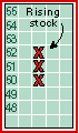
Figure 1: RISING STOCK. In order to add an X to the top of this column (signifying a continuation of the uptrend), the next day's high must be at least $53.
...Continued in the January 2002 issue of Technical Analysis of STOCKS & COMMODITIES
Excerpted from an article originally published in the January 2002 issue of Technical Analysis of STOCKS & COMMODITIES magazine. All rights reserved. © Copyright 2001, Technical Analysis, Inc.
Return to January 2002 Contents