The Bend, Or The End?
Set Up Your Trades With The Swing Indicator
by Teresa Lo
Knowing when and where classic chart patterns tend to form is as important as identifying the patterns themselves. Here's how one trader uses a combination of indicators and simple geometry to set up trades."The trend is your friend except at the ends, where it bends." -- Ed Seykota
Investors and traders are no doubt familiar with Ed Seykota's oft-quoted saying, as it describes price action found in the capital markets. This idea has inspired traders to focus on finding stocks that are trending in order to enter on retracement patterns; however, not all trends are created equal, as those traders have no doubt discovered.
Sayings aside, there are qualitative and quantitative differences between "a bend" and "the end." Traders who can gauge whether a given bend is a large pause instead of a reversal are more likely to capitalize on the trend. Knowing how to identify areas where larger retracement and price congestion patterns actually begin is useful, because large consolidation patterns tend to form and set up price breakout trades in larger time frames in the direction of the prevailing trend.
THE BEND THAT ENDS THE TREND
An uptrend that emerges after a long period of base-building is often distrusted, recognized only slowly by participants; the upward price movement can be unconvincing. Meanwhile, the late stages of an established uptrend are characterized by extreme positive sentiment, skyrocketing prices, and wild speculation by that portion of the public engaged in momentum trading.
Picking tops and bottoms -- locating reversal patterns -- is usually
considered to be a tricky, high-risk method for setting up trades, but
learning to identify such areas often gives a trend trader the edge because
this skill can be used to exit trades on a timely basis. In the end, finding
price patterns boils down to looking in the right places; knowing where
to look for likely places for patterns to begin forming is helpful. Toward
that end, there are several techniques and tools that traders can consider.

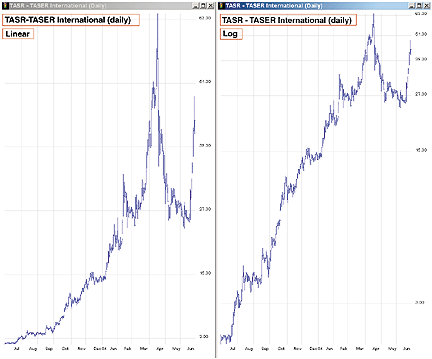
Figure 1: Profit from price patterns. The price chart on the left is plotted in linear scale, while the one on the right is in logarithmic scale. Note the nearly vertical price move between mid-March and mid-April 2004 is much more pronounced when viewed in linear scale. The parabolic move, also known as a spike, preceded a 60% drop in price over the next three weeks between the April 19th high and May 10th low.
...Continued in the September issue of Technical Analysis
of STOCKS & COMMODITIES
Excerpted from an article originally published in the September 2004 issue of Technical Analysis of STOCKS & COMMODITIES magazine. All rights reserved. © Copyright 2004, Technical Analysis, Inc.
Return to September 2004 Contents