Best Thing Since Sliced Breadth
Breadth Statistics: What Do They Tell You?
by Tom McClellan
Let's revisit the advance/decline line.
Advance/decline (A/D) statistics have been used since 1926, when they were first analyzed by Col. Leonard Ayres and James Hughes of the Cleveland Trust Co. In the early 1960s, the use of the advance/decline line gained more attention with the writings of Richard Russell, Joseph Granville, and others who were able to demonstrate its effectiveness when it showed a diverging condition during the 1961-62 market top.
A/D line basics
There are different ways to construct A/D lines. The most common method is by summing up the daily breadth (advancing issues minus declining issues), which means that the value of the A/D line changes by each new day's breadth reading. Although this calculation is simple, it poses problems for long-term comparisons. Over the years, there has been an increase in the number of issues traded. A difference of 100 in A/D would have a significant meaning in the 1930s, when there were only 600 or so issues traded. But now, with more than 3,400 stocks traded on the New York Stock Exchange (NYSE), that difference would not mean as much. Because of this, a "normal" A/D line may have mismatched amplitudes of strong or weak breadth days in long-term comparisons.
One way to get around this is by using a ratio instead of the raw breadth statistics. You can calculate this ratio using the formula:
![]()
Although the number 1000 is used here, you can use other values as long as you are consistent throughout the data.
From Figure 1, you can see that for periods of up to a couple of years there is not much difference in appearance between the normal A/D line and the A/D ratio. Because of this, many technical analysts use the raw data for short- to intermediate-term analysis (days to weeks).
As your time horizon increases, the effect of the changing number of issues traded becomes more important. In Figure 2 you see the normal A/D line and the cumulative A/D ratio on a much longer time frame. Note that the normal version has already gone above its 1958 high, while the ratio-adjusted version has not. The latter version is indeed acting strongly, and is at a higher level than its 1998 top. This is a very bullish condition, but it is not looking as strong as the normal one, which is distorted by the larger number of issues traded.
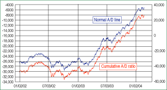
FIGURE 1: A/D LINE VS. A/D RATIO. The two lines have been moving in sync since 2002.
...Continued in the December issue of Technical Analysis
of STOCKS & COMMODITIES
Excerpted from an article originally published in the December 2004 issue of Technical Analysis of STOCKS & COMMODITIES magazine. All rights reserved. © Copyright 2004, Technical Analysis, Inc.
Return to December 2004 Contents