Brick By Brick, Building A Chart
Trading Renko Charts
This charting technique can be used to display trends that may not be that obvious in a bar or candlestick chart.
Renko charts were invented by Japanese traders hundreds of years ago and named for renga, a Japanese word for "brick." How are they different from bar or candlestick charts? First of all they are visually attractive, making it easy to filter noise and isolate trends. They show symmetry and are effective in determining the major trend and support & resistance areas. Renko charts are also efficient in signaling trend-reversal patterns.
WHAT ARE THEY?
Renko charts are another way of representing price changes. They display trends in such a way that may not be obvious in a bar or candlestick chart. Renko charts are able to suppress the noise display and produce uniformity in the underlying trend. Although useful, renko charts also produce whipsaws and have serious trading caveats, but overall there are advantages to renko-based trading. One is that a trader tends to stay in a trade longer than other trend-following techniques.
THE ADVANTAGES
Compared to more conventional charts like bar charts and candlestick charts, renko charts make the decision-making process easier. A typical one-minute bar chart of the emini Russell 2000 (ER2) would have about 405 bars in a day, whereas a similar renko chart (of one-point box size) would produce 25 to 50 renko boxes. The fewer boxes reduce the number of variables you need to consider for your trading decisions during the trading day. If you look at a five-minute chart, a bar chart would display 81 bars, whereas renko charts would display 17 to 35 boxes on a typical day. So a longer time frame chart would produce fewer renko boxes.
In Figure 1 you see a comparison of a renko and bar chart display on
five-minute charts of the ER2. Figure 1A displays a renko box formation
and Figure 1B shows a conventional five-minute bar chart. On January 30,
2007, there were nine one-point renko boxes on the five-minute chart, whereas
on the five-minute bar chart there were 81 bars. You can see a similar
situation on January 31.
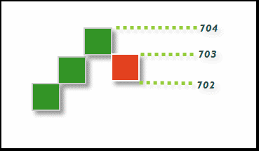
FIGURE 1A: RENKO BOXESIn Figure 2 you see a spreadsheet comparing one-minute, five-minute, and 30-minute range renko and bar charts on various trading days.
...Continued in the August issue of Technical Analysis of STOCKS
& COMMODITIES
Excerpted from an article originally published in the August 2007
issue of Technical Analysis of
STOCKS & COMMODITIES magazine. All rights reserved. © Copyright
2007, Technical Analysis, Inc.
Return to August 2007 Contents