Corona Charts
by John F. Ehlers
Supercomputers, superdelegates, and now, superindicators. Here's a look at the up-and-coming group of indicators that tell you when a signal is strong and when it's not.
Never heard of corona charts? You will. They are the next-generation group of superindicators because they not only give you a multidimensional view of market activity, but also because each indicator alerts you when its signal is strong and when it is weak.
Each indicator in this group is based on sound scientific measurements rather than on anecdotal evidence and heuristics. All the indicators start with the measurement of the dominant cycle and are therefore adaptive to market conditions. There are a total of four indicators in the corona chart series. These are:
- The spectrum (from which the dominant cycle is extracted)
- The cycle signal to noise ratio
- The swing position and
- The trend vigor.
The spectrum measures cyclic activity over a cycle period range from six bars to 30 in a bank of continuous digital filters. Longer cycle periods are not taken into consideration because they can be viewed as trend segments. Shorter cycle periods are not considered because of the aliasing noise encountered with the data sampling process. The amplitude of each filter output is compared to the strongest signal, and the result is displayed over an amplitude range of 20 decibels (dB).
This display is in the form of a heat map. Now, imagine the strongest signal being white-hot. As the amplitudes decrease, the display "cools off" through red-hot to ice-cold. The colors range from bright yellow for the strongest signal to black for the weakest. The dominant cycle line is extracted from the strongest signals in the spectrum.
The spectrum display is described with reference to Figure 1. The spectrum is time-synchronized with the bar chart above it. The vertical axis of the display shows the measured cycle period over the range, again from six bars to 30. The ideal condition is a thin horizontal yellow line. This denotes a consistent cycle period that is well focused at the dominant cycle.
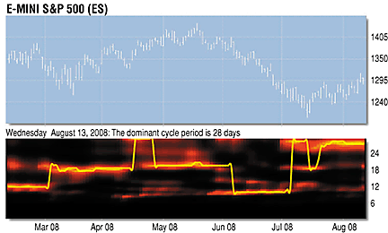
The market, however, is often not so accommodating. You will see periods where the spectrum gets fuzzy; that means the cyclic energy is not concentrated at the dominant cycle and is more vague. You will also see times when the dominant cycle is drifting upward or downward, signifying slow changes in the cycle periods.
...Continued in the November issue of Technical Analysis of STOCKS
& COMMODITIES
Excerpted from an article originally published in the November 2008 issue of Technical Analysis of STOCKS & COMMODITIES magazine. All rights reserved. © Copyright 2008, Technical Analysis, Inc.
Return to November 2008 Contents