AT THE CLOSE
Credit And Stock Markets
Use the connection between the credit and equity markets.
Although a general understanding of the intermarket dynamics between the credit and equity markets exists in the investment world, it really hasn’t gone beyond the axiom of “What’s good for bonds is bad for stocks and vice versa.” The global credit crunch over the past 18 months or so, however, brought the credit markets to the front burner of news, and as a result, these days, not many people are left who haven’t heard of Libor when just a couple of years ago, hardly anyone outside of the credit markets knew about it. The same applies to credit default swaps.
When we take a look at the credit market indicators from a technical perspective, we see strikingly strong connections to the equity markets. I will delve farther into the complex relationship between the credit markets and equity markets and explain how we can use technical analysis to take advantage of this connection.
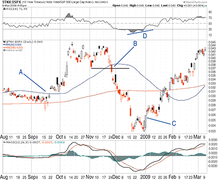
Figure 1a shows the ratio of 10-year US Treasury yield to the Standard & Poor’s 500. It demonstrates that had investors studied the chart, they could have foreseen the devastating drops in the stock market. This ratio does a great job of spotting money flows and dislocations between Treasuries and stocks before the pronounced effect in the respective markets occurs.

Figure 1a: ratio of 10-year treasury yield to s&p 500. Analyzing this ratio can be a valuable tool to use in predicting meaningful moves in the equity markets.
10-year T-note/S&P 500
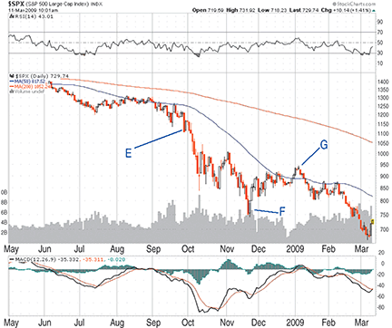
Let’s examine several important points on the chart in Figure 1a that shows the period from August 2008 to March 2009. On September 22, 2008 (point A), the ratio gapped up from a tight six-week long base while piercing through the 50-day moving average (MA). The S&P 500 (Figure 1b) did not break down definitively until September 29, 2008 (point E).

Figure 1b: S&P 500. Here you see how the S&P 500 moves relative to the ratio of 10-year Treasury yields to the S&P 500.
The move took the index from 1200 to a crushing 741 (down 38%) within two months. After forming a clear double-top formation from October to December, the ratio broke down from a double-top formation while falling below the 50-day MA on November 24 (point B) at the same time. That was just a day after the S&P 500 found a bottom around 741 and appreciated about 200 points or about 27% (point F). On January 1, 2009, the ratio this time broke up from a short double-bottom formation (point C). A few days later, on January 6, the index started on another grueling drop (point G).
At the time of this writing, the index stands at 676.53, down approximately 27% from January 6, 2009. Going a step further, chartists can look at divergences and anticipate or confirm breakouts in the charts of ratios. For example, a clear positive divergence is visible around December on the relative strength index (Rsi) (point D).
As the datapoints indicate, the ratio of 10-year Treasury note yield/S&P 500 can be a valuable tool in predicting meaningful moves in equity markets. A chartist watching either chart on its own would have waited longer to get any kind of signal/confirmation.
Credit default swaps
Credit default swaps, commonly known as Cds , have been brought to attention by the media during the global financial crisis as the complex financial instruments that had a major influence in the destruction of the credit markets. In simple terms, a Cds will help a market participant speculate on an entity’s credit quality or provide protection to a participant from default of a company.
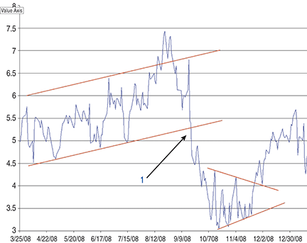
In Figure 2, you see the chart of Cdx IG10: Vix ratio. IG10 is the benchmark index for credit default swaps of investment-grade companies. It rolls onto a new version approximately every six months. Vix is the Cboe volatility index and is a popular measure of fear in the stock market. Cdx , on the other hand, indicates the price of protecting against credit deterioration in the credit markets. Essentially, this ratio becomes the extent of fear in the credit markets relative to the extent of fear in the equity markets. As this ratio goes up, it may indicate that the fear in bonds is more than the fear in stocks and money should get out of bonds. As the ratio goes down, it may indicate that the fear in stocks is more than the fear in bonds and as such, money should exit stocks.

Figure 2: CDX IG10: VIX ratio. As this ratio goes up, it may indicate that the fear in bonds is more than the fear in stocks. As the ratio goes down, it may indicate that the fear in stocks is more than the fear in bonds.
In Figure 2, it shows that the uptrending price channel broke down around September 20, 2008, indicating fear in stocks relatively higher than fear in bonds (point 1). Subsequently, the stock market plunged 34%. Check out the symmetrical triangle that formed between October and the middle of November. The triangle resolved to the upside around November 24. As mentioned earlier, the S&P 500 started a rally on November 21 that took the index from around 750 to 931 for a very respectable 24% bear market rally.
A forecasting tool
As the charts suggest, there is a vital link between the stock market and the bond market. Although this relationship can be exploited by studying the stock-related charts and/or the bond-related charts individually, market dislocations and long/short entry points become clearer when stock and bond indicators or indexes are used together to create ratios.
Suggested reading
Banks, Erik; Morton Glantz; and Paul Siegel [2007]. Credit Derivatives: Techniques To Manage Credit Risk For Financial Professionals, McGraw-Hill.
Murphy, John J. [1999]. Technical Analysis Of The Financial Markets: A Comprehensive Guide To Trading Methods And Applications, New York Institute of Finance.