TRADING TECHNIQUES
Simple Yet Insightful
Spherical Wave Filters
Why do Elliott wave patterns develop in price data? This may be the reason.
Of all the geometric forms, the sphere is the simplest. On a two-dimensional plane, the sphere is displayed as a circle or ellipse. The exact center of a circle is its radius point, which is precisely halfway between any opposite surface points. The radius is in turn half of the diameter of a circle, and it is its center of mass. On a two-dimensional chart where time is displayed linearly from left to right on the x-axis (the horizontal axis in a plane coordinate), a circle cannot be displayed because it would indicate a regression in time as its curvature took it backward beyond the horizontal.
The bell curve
To display a circle in linear time, you need to dissect it from left to right to create two sequential and equal half-circles (Figure 1). Here we will pick up the extreme left edge of the bottom half-circle and rotate it until that edge is the extreme right surface. This creates a sine wave. By continuing the process with more circles, you end up with undulating sine waves. These waves can be considered to be linear expressions of nonlinear circles. If you segment any of these sine waves by dividing it at an extreme bottom and at the next extreme top, you will have created an S curve. If you continue from that point at the top and segment at the next extreme bottom, you would have created another but opposite S curve. When you join them all together, the famous bell curve is displayed. So the bell curve is really nothing more than a parsed segment of undulating sine waves with the basic geometric form of the circle as the source.
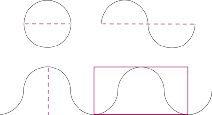
Figure 1: DISSECTING A CIRCLE. If you picked up the extreme left edge of the bottom half-circle and rotated it over until that edge is the extreme right surface, you would have created a sine wave. By continuing the process with more circles, you end up with undulating sine waves.
With the y-axis representing population magnitude and the x-axis representing variation from mean, the bell curve represents the typical distribution of biological attributes that are characteristic in nature. The bell curve shows that nature repeats for most of a biological population. This is graphically displayed in the wider body of the bell. The small numbers at the flanges represent extreme variants, nature’s way of providing an insurance policy of sorts in case there are significant environmental changes.
Elliott waves
Waves, even those originating in stock market data, are manifestations of nature’s laws. As displayed in the bell curve, this principle describes the continuous vectoring on price charts. You could say that waves exhibit an inertial bias from their beginning toward their eventual destiny of growth, maturity, and completion. This explains why we observe trends in all human endeavors, and most specifically in markets.