CHART PATTERNS
The Prevailing Edge
Situational Trading
How do you know the markets are beginning to recover?
During periods of downslides, many cautious investors remain on the sidelines until signs of recovery emerge. Fortunately, trading activity can spot the beginning of a recovery. Sometimes, however, it can be a challenge; in the past several years, a variety of trending landscapes have presented themselves, making that hunt something of a trial.
Sometimes we do ourselves a disservice by including all the different trading patterns that have popped up into the same study. The days not specific to a particular pattern will water down our results. For instance, take the average of six random trading days:
(2 + 2 + 2 + 11 + 14 + 17) = average 8
But 8 is not an accurate reflection of the integrity of these numbers. The average does not place sufficient emphasis on the extreme scores, nor does it consider the order of sequence. For this article, I will limit my analysis to those days that come together to form a V-shaped pattern. The orange circles in the price chart in Figure 1 identify several of these steep corrections with abrupt recoveries.
The analysis of the trading days shown, 1,284 days (January 1, 2004, to February 14, 2009), resulted in 10 qualifiers for this V pattern; the average decline was 16.40%, lasting 22 trading days. On the right side of this formation, I am using an eight-day recovery as my benchmark; the average return for these eight trading days was 4.39%.
If all 1,284 trading days were used in this analysis, doing so would render the predictive analysis less effective. The golden circles in the line chart represent the current trading environment. If you confine your analysis to those 10 patterns that form the shape of a V, you can improve your understanding of this pattern.
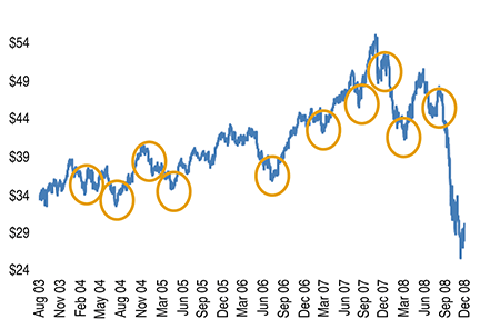
Figure 1: The 10 circles represent a V-SHAPED bottom. After a significant downturn the market tends to overshoot its target. When investors realize this, the market abruptly changes course. In looking back at this particular pattern, changes in trading volume were a meaningful harbinger of the beginning of the downturn as well as a turnaround in the price of the PowerShares 100 (NQ: QQQQ).
I describe this analysis as if these patterns are likely to repeat. However, seven of these V patterns occurred during a bullish backdrop, so be careful extrapolating these results into a different setting. Before examining the right side, lets begin with an examination of the left side of this pattern.