Websites For Traders
Newsimpact.com
NewsImpact.com is a website devoted to foreign exchange. It has two major components: alerts that can be sent to your cell phone, and SpikeCharts. The alerts, which are sent as Sms messages, are of two types: news and price. The news alerts are received when economic data is released and price alerts are received when the price level you set your alert to is hit. This is very useful when you are not sitting in front of your quote screen; given that forex trades around the clock, there is a strong chance that you are not going to be at your desk 24 hours a day. You can set your alert specifications online. All you have to do is enter your cell phone number and the alerts are sent to your phone. The costs of the services vary. For SpikeCharts it is $20 per month, mobile price alerts are $20 a month, and mobile news alerts are $20 a month. They do have bundle offers: You can have any two services for $30 a month or all three services for $40 per month.
Analytical features
The default screen for SpikeCharts displays a top chart with your selected economic indicators showing actuals versus predictions. The bottom portion of the initial screen provides access to economic indicators and displays rate/pip charts.
Economic forces have an impact on the price behavior of forex markets. The features at newsimpact.com make it possible for you to see this impact on the price activity of various forex pairs. For example, suppose you want to see the impact of US jobless claims on the currency markets. You would select the indicator from the list of economic indicators. Once that was done you would see a display of the overview chart on the top showing 12 months of data (Figure 1). This shows the forecast vs. actual data. The deviation between the actual and forecasted data is displayed on the chart. So if you saw a significant deviation, you could double-click on that bar and a chart specific to that date would be displayed. This gives you the opportunity to analyze how the currency market was affected on the day the data was released.
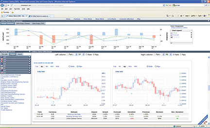
Figure 1: default screen. The top chart shows the actual vs. forecasted numbers for 12 months. Along the left side is the list of economic indicators and on the right side are the rate/pip charts. The rate/pip charts capture the exchange rates of your selected currency pairs at the time the actual data is released.
Another option is to view the Spike/Range Release tab (Figure 2). Here you see the range of any price spikes on the day the data was released. From Figure 2 you can see that the release on September 10, 2009, did cause prices to spike. If you double-click on the bars for that date, youll see a display of the chart for that specific date, giving you the opportunity to analyze price action in more detail (Figure 3). You can look at various currency pairs to see which ones were affected by this release.
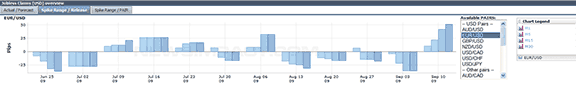
Figure 2: spike range/release. Here you see how a news release affected the performance of a specific currency pair historically.
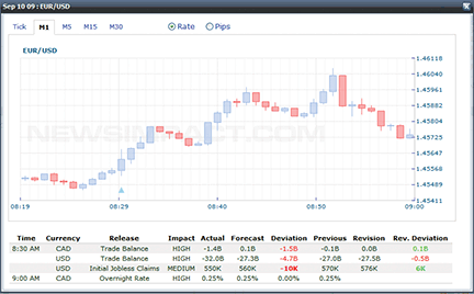
FIGURE 3: SPIKE CHARTS. You can easily switch between rates and pips on the charts. You can also select any of the currency pairs and the time frames supported by newsimpact.com.
The pip/rate charts that are displayed below the overview window are available in tick, one-, five-, or 30-minute resolutions. You can view one currency pair on the left and another on the right, or view the same ones in different time frames, or view one as pips and the other as rate charts. If you want to use more screen space to see the rate/pip charts, you can click on an expansion button and the two rate/pip charts would occupy the entire screen. The rate/pip data is captured shortly before and after the release of the economic data, and the different data resolutions let you see how long it took a specific currency pair to react. Below these charts you will see a detail window in a tabular format.
Another interesting feature available on this site is the Spike Range/Pair option. You see a display of the change in the exchange rate for all the currency pairs supported by the particular economic indicator (Figure 4). This allows you to quickly compare the various currency pairs and be able to see which ones were affected the most over different time frames. You can select various dates from the dropdown menu on the right of the chart. Newsimpact.com provides data for 20 different currency pairs and they cover about eight different regions/countries.
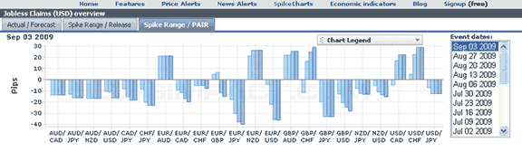
FIGURE 4: SPIKE RANGE/PAIR. Here you see the change in the exchange rate of the different currency pairs for the date you select.
The big picture
Forex traders will appreciate knowing which currency pair makes the largest move when a particular economic data is released. Labor data has always been a key data to watch for since it has a significant impact on the currency markets. Theres a lot of other data that should not be ignored such as retail spending, manufacturing data, new factory orders, and consumer confidence.
Newsimpact.com is definitely an interesting site. The cell phone alerts are probably their most popular feature, but theres a lot of valuable information available too. Dont forget to visit their blog, which contains a lot of forex-related articles.