CHART PATTERNS
Deal Or Dud?
High & Tight Flags
Does the high & tight flag work as well as some say? Find out here.
Ihave spent 30 years playing the markets. During that time, I have written several books including two encyclopedias covering 166 price patterns from chart patterns to event patterns to candlesticks, but one pattern outperforms the rest: the high & tight flag. New research indicates that this chart pattern may not live up to expectations. Let’s take a closer look.
What is it?
The high & tight flag was popularized by William O’Neil in his book, How To Make Money In Stocks. He mentions several identifying characteristics, but I let the pattern’s performance statistics tell me what is or is not important. We agree that a substantial price rise should occur quickly: a move of at least 90% (nearly a double) within about two months.
The flag portion of the high and tight flag (Htf) need not look like a flag at all. In fact, many Htfs sport a loose collection of price movement that doesn’t resemble any recognizable pattern. What you are looking for is a consolidation region near where price doubles.
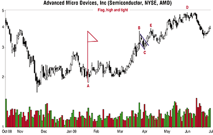
For example, Figure 1 shows what a high & tight flag looks like. Price begins its climb from a low of 1.86 on January 23, 2009 (point A), and reaches a high of 3.78 on March 25, 2009 (point B), or a 103% move in 42 trading days, which is also the maximum time I allow.

Figure 1: an example of a high & tight flag. Here you see how after price doubles, it consolidates, dropping back about 23%. This high & tight flag has a nice flag pattern. So once the stock reaches the flagpole top, price trends downward following two parallel lines, resembling a flagpole.
After price doubles, it consolidates, dropping back to a low at C of 2.92, for a drop of 23% in about a week. This Htf has a nice flag pattern. That means once the stock reaches the flagpole top, price trends downward following two parallel lines, resembling a flag on a pole. I show that on Figure 1 outlined in blue.