TRADING SYSTEMS
Too Far, Too Fast
Making The Most Of A Trend
With The Disparity Index
In volatile markets, it’s difficult to forecast the formation of peaks and troughs. The disparity index is an indicator that helps you squeeze the best out of a trend whether you are trading equities, futures, or forex.
Prices often rise or fall rapidly in a short period of time. But what is considered too far and too fast? How can we quantify these terms? Many techniques and indicators are used already to deal with this task, among them trendline slopes, breakouts, up and down gaps, and oscillators (rate of change, moving average convergence/divergence [Macd]).
In these fast rises and falls, it is only natural and normal to miss the peaks and troughs. At any given time, there is at least one market and several sectors and stocks that display excess. Is there an indicator that can improve your entries and exits? In this article I describe a simple indicator called the disparity index (Dix) and its use in warning about the formation of possible peaks and troughs in volatile market conditions. The Dix can best be used in situations when prices rise or decline rapidly in a short period of time.
Disparity index
How many times have you given back the market too much of your gains? If it happens more often than not, the disparity index is for you. The index is a simple statistical measure of price deviation from a mean. It is used as a tool, together with other indicators, for fine-tuning your trades.
If you stretch a coil, the more you pull at both ends the greater the danger of it snapping. However, when released, the coil returns to its initial position. A rubber band and, to some extent, a pendulum display similar behavior. After being stretched or swung, both return to a neutral state before going the other direction. Asset prices behave in a similar way; the more they deviate from a reference value, the greater the probability is to return to the original level or even exceed it. Simply, it is a reversal to the mean.
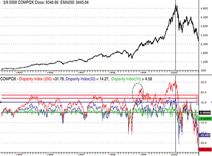
Figure 1: NASDAQ COMPOSITE INDEX AND DIX. The disparity indexes for 50 and 200 days are shooting off above consensus and issue a warning in late 1998.
Let’s start with the Nasdaq Composite Index (daily chart in Figure 1). From the price chart on the top pane, you can see how the Nasdaq evolved before reaching its peak in 2000. In 1999, the index was subject to different opinions: some said that the Nasdaq was not overvalued, while others warned that the traders should get out of that market as soon as possible. As always, the lack of a measurement tool led to misinterpretations. The disparity index introduces that much-needed objectivity in situations where things are or look abnormal (for example, rapid price rises or declines during short periods of time).