QUANTITATIVE METHODS
The Future And The Filter
Predicting Market Data Using The Kalman Filter
Part 2
Can the Kalman filter be used to predict future price movement? In this second part of this series we answer this question.
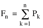
Previously, we discussed the Kalman filter and the alpha indicator. This time, we study the accumulation of profit/loss through the fortune chart. We also backtest the filter and analyze the results. The profit/loss on day k may be written as
where the quantity in parentheses is the relative price-change, or return, on day k, A is the trade amount in dollars, and Wk = 1 if αk > C, Wk = -1 if αk < -C and Wk = zero otherwise (W for wager). Note that Wk = 0 corresponds to no trade on day k and so Pk = zero as well. Further, note that A is the same for every trade. For the Ford data, C was found to be 0.38, and Figure 1 shows its Pk values, where the trade amount A was set to $1.00 (zero values are not shown). The red point at November 28, 2008, represents the trade having the largest profit. The reason for the large profit can be seen in Figure 2, Part 1, where the red point in Figure 1 corresponds to point 8 in Figure 2. The prediction of 1.84 was nowhere near the actual at 2.47, but it was in the correct direction, up from 1.72, resulting in a 0.436 profit. The fortune sequence is the accumulation of the Pks:
Its last value, FN, is called the last-day fortune (Ldf) and represents the amount of profit/loss realized at the end of the simulation. A graph of Fn versus day n, corresponding to the Pk data in Figure 1, is shown in Figure 3. The Ldf is 1.37 on 124 trades, or about 1.1% average profit per trade. This is, of course, an idealized fortune in which there are no trade commissions, and trades can be transacted at the prescribed buy/sell prices (no slippage). It is used here primarily to evaluate the Kalman filter’s ability to predict the direction a stock price will take.
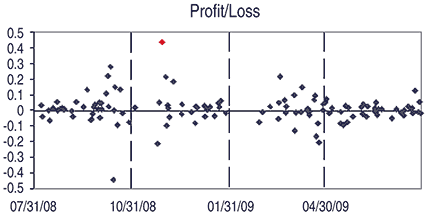
Figure 1: profit/loss. Here you see the Pk values for the Ford data from Figure 1 in Part 1: T = 1.86, C = 0.36, A = 1. The red point at 11/28/08 represents the trade having the largest profit.
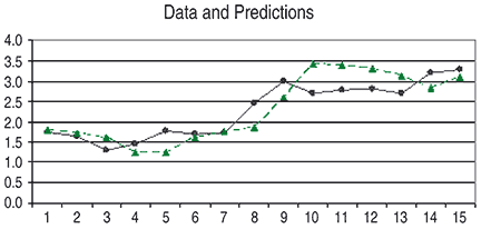
Figure 2: data and predictions. Here you see the Kalman predictions for a portion of the data from 11/18/08–12/09/09 (green) together with the data. The red point in Figure 1 corresponds to point 8 in Figure 2, Part 1.
The fortune plot is one indicator of that ability, and so is the profit ratio, defined as the ratio of number of profitable trades to total trades. In the Ford simulation that we discussed in Part 1, it was 0.59. The profit ratio can be roughly visualized as the ratio of number of points above the zero line to total points.