CHARTING
Know Your Support & Resistance
Trading With Volume Profile
Daytrading stocks is largely a game of knowing critical support and resistance price levels. Here’s a valuable tool that identifies these levels quickly so you can make sound trading decisions.
Typically, you need to scan through a substantial number of intraday stock charts in order to identify these critical support and resistance levels within any individual stock. This is a time-consuming and tedious process. Moreover, historical chart data is not always available for a time period extending beyond six months, as some charting packages stop showing data more than six months in the past.
Volume profile Volume profile is a valuable trading tool that can save time and allow you to more easily see significant price levels that occurred in the more distant past. Volume profile is sometimes referred to as “price by volume.” It is somewhat similar to the price activity chart in that it displays cumulative volume by price. It is also similar to Market Profile, but it does not include the time component and is considered a separate tool. Essentially, volume profile is a chart showing the amount of volume (number of shares traded) at each price level over some length of time. Instead of scanning through many intraday charts of a stock to find key support and resistance price levels, you can simply generate a volume profile chart in a fraction of the time. In addition, you can more easily see support and resistance levels from longer periods in the past.
Support and resistance price levels are important to most trading styles and of utmost importance to daytrading. Identifying these price levels correctly and quickly is not always an easy matter. For example, you might look over candlestick charts on hourly, daily, 15-minute, and five-minute time frames in order to identify and track significant support and resistance levels within a particular stock of interest.
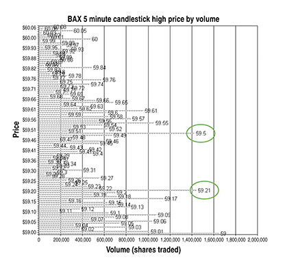
Figure 1: volume profile chart for baxter international (7/30/09–1/29/10). This chart was created by summing up total volume traded at each five-minute candlestick’s highest price over the previous six months. Note the circled prices have much more volume. They should be more significant support and resistance levels than other nearby prices with much less volume.
When scanning over a candlestick chart for price levels, you have to decide whether to focus on candles with heavier volume, candles that occurred more frequently at one price, the time of day the candle formed, and so forth. This is typically a time-consuming process and can be prone to costly errors if not done carefully.