CHARTING
It’s Still A Classic
Point & Figure Box Sizes
Even after all these years, will point & figure charts tell you when to get in and out of the market?
After the early 1970s stock market debacle, I spent years yearning for a simple tool that could tell me when to get in and out of the market. Then one day I wondered if point & figure (Pnf) charts would do the trick, using chart reversals as indicators.
I worked with Pnf as a momentum indicator, and then exclusively for single stocks in cycles and trends. I used Yahoo! Finance data to manipulate Pnf box sizes and record profits from momentum reversals. I found that box size could make a world of difference in charting the data, rather than using a traditional box size of $1 for all stocks priced between $20 and $100. That’s a big price range for just one box size, even for pattern recognition purposes.
Using Pnf box (or block) sizes, and calculating chart reversal profits for each, I discovered there were “sweet spots” in size that produced good profits from chart reversals. Moreover, these box sizes continued to work for at least a short period over any other size. It occurred to me that stock trends fall outside “fair coin” tosses as written about by John Paulos in his book on mathematical literacy, Innumeracy.
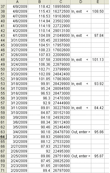
Figure 1: apple (AAPL) turns around. Here you see a brief history of trading AAPL. The closing price is displayed in column B and volume in column C. Column D displays the position status and in column E you see the anticipated reversal points.