NEW TECHNIQUES
by Christopher L. Cagan, Ph.D.
Here's a unique technique to understand the cycles prevalent in the markets.
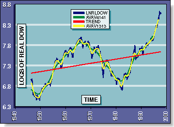
First, take the monthly Dow index and divide by a deflator (for our purposes here, the average of the Consumer Price Index [CPI] and Producer Price Index [PPI], with 1982-84 = 1.00 as the base period) to compute the real DJIA in constant dollars and remove the effect of paper inflation. Take the natural logarithm as the result, to be called LNRLDOW. This series works on a logarithmic or percentage basis, so a motion from 1,000 to 2,000 has the same magnitude as a motion from 2,000 to 4,000 (Figure 1).
A Fourier analysis reveals periodicity at the well-known cycle length of about 41 months and at about 13 months (at shorter time horizons, the motion is less cyclical and less predictable). To get a smooth motion, it is best to take a double-smoothed moving average, which uses a triangular-weighting scheme. The 41-month double-smoothed moving average of LNRLDOW will be called AVAV4141 and the 13-month double-smoothed moving average of LNRLDOW will be referred to as AVAV1313. By studying the motions of AVAV4141, we can lay in a long-term trendline with background growth of about 1% per year (after inflation). Figure 1 presents all four data series beginning in 1946.
PHASE DIAGRAM: LONG CYCLE
To estimate the motion of the long cycle, take AVAV4141 and subtract the background trend to produce the amplitude of the long cycle above or below this trend. We can estimate the velocity of this cycle by taking monthly differences and double-smoothing over the best periodic width of about 29 months, and multiplying by 12 to produce an estimated yearly velocity called VELOC.
We are now ready to construct our first phase diagram, presented in Figure 2. In this chart, the amplitude of the long cycle is the horizontal axis and its velocity up or down is the vertical axis. The phase diagram always moves clockwise.
In Figure 2, we see that the long cycle reached maximum amplitude in 1966 (representing the peak of a bull market) and then fell until 1982 (amplitude falling, negative velocity), when it reached the bottom of that bear movement. The market then rose, moving up and to the right from 1982 onward.

FIGURE 1: LOGS OF REAL DOW. Here is the DJIA adjusted for inflation (LNRLDOW) showing the trend, the 41-month double-smoothed moving average (AVAV4141) and the 13-month double-smoothed moving average (AVAV1313)
Christopher L. Cagan has written on the stock market and national economic growth cycles. He can be reached at 1815 S. St. Andrews Place, Los Angeles, CA 90019, 213 735-3320.