Hours And Days
The FX Daily Conundrum
by Kristian Kerr
In a 24-hour market, what is the best time frame to use when looking at charts?
The rising popularity of foreign exchange trading over the past few years has been impressive. Equity traders fed up with trying to eke out profits in the brutal bear market environment have flocked to the fast-paced spot currency markets in record volumes. This rise in forex's popularity can mostly be attributed to the clear advantages that currency trading has over other markets. Unlike trading equities, foreign exchange offers traders true 24-hour trading, excellent liquidity (over $1.5 trillion a day), and great leverage (up to 200 to 1).
Another big factor behind the increase in retail spot exchange volume has been technically driven equity traders who are switching to currencies. The technical nature of this market makes it much easier for equity traders to switch to foreign exchange (also referred to as forex or FX) than to other markets, although forex does have its own nuances that must be understood. The biggest issue for most technical traders making the switch is the daily chart. Due to the structure and nature of the currency market, the daily is not as effective and useful in FX as it is in equity trading.
24-HOUR TRADING
The nonstop, round-the-clock nature of trading in the foreign currency market is definitely one of its most enticing features, but 24-hour trading brings its own set of issues. One of the most important is the validity of the daily chart. Short-term equity traders rely heavily on the daily chart to determine proper entry and exit points. After switching to forex, many traders like to use the same techniques that they used to trade equities and, for the most part, technical equity trading methods can be successfully adapted to trade FX. However, traders often run into problems when they try to use techniques based on daily chart patterns.
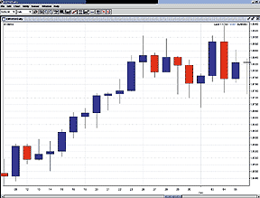
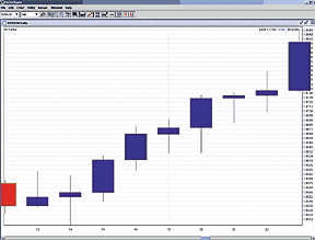
Figure 1: Daily chart of EUR/USD -- same time span. The two charts are similar, but they differ enough to wreak havoc on the signals of a pattern-based trader. The chart on the bottom shows a clear hammer off a key support level, while the same candle on the top chart is not nearly as significant. On many bars, the highs and lows (popular entry points for swing traders) are different.
Excerpted from an article originally published in the August 2003 issue of Technical Analysis of STOCKS & COMMODITIES magazine. All rights reserved. © Copyright 2003, Technical Analysis, Inc.
Return to August 2003 Contents