Waves And Fans
Fibonacci And Gann Projections
by Dennis D. Peterson
It's time to have a little fun and see what a day-at-a-time replay can reveal in terms of future projections.
In 2002, I wrote an article in Working Money about using Fibonacci projections. Since then, the charting techniques in eSignal have improved considerably and with the generous help of eSignal's Jason Keck, I decided to revisit the topic. Along the way, I thought, why not throw in couple of other goodies, like Gann's square of nine and a retracement readout? The Fibonacci projections used here were first described by technician Robert Miner, who proposed this system in his article "A Spreadsheet For Time Ratio Analysis" in the December 1992 STOCKS & COMMODITIES.
THE OBJECTIVE
The system I will describe attempts to predict future turning points - that is, pivot peaks or valleys. It finds these turning points by applying Fibonacci ratios to the most recent swings. When it comes to trading, it's helpful to rely on a system, since it removes emotion from trading.
But it wouldn't be wise of you to rely on a system that has not been backtested. The challenge when backtesting this particular system comes when the most recent swing depends on the point in time (peak or valley) where you start the backtesting. In a typical price chart, each point will have a unique set of projections, and in order to keep track of them, you need to have a unique identifier for each. But visually, this would be confusing. Ideally, you need to choose a point in time in the past, march forward one bar at a time, and watch how the actual swing points either hit or miss a projected swing point. This is made possible by eSignal's "Replay" function.

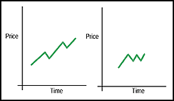
Figure 1: Examples of price series. In the left-hand price series, prices move up with longer upswings and smaller downswings, which is typical in an uptrend. In the right-hand price series, the upswings are almost equal in length to the downswings, which is typical in consolidating markets. The chart on the left could start looking like the one on the right when prices shift from an uptrend to a consolidation. Conversely, the chart on the right could start looking like the one on the left when prices start trending up.
Excerpted from an article originally published in the October 2004 issue of Technical Analysis of STOCKS & COMMODITIES magazine. All rights reserved. © Copyright 2004, Technical Analysis, Inc.
Return to October 2004 Contents