Kagi Charts
by Jayanthi Gopalakrishnan
If you've ever seen a reference to this particular form of candlestick charting and wondered what they were, you can find out here.
The financial markets exist because of the complimentary relationship between bulls and bears -- one cannot exist without the other. The key is to recognize which has control of the markets and identify when that control changes. One way to do this is through kagi charts.
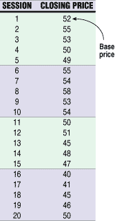
FIGURE 1: CLOSING PRICES. To draw the first line of a kagi chart, you must compare the closing price of the second session to the closing price of the first session, which is referred to as the "base price."
Kagi charts, which have also been known as key charts, price range charts, hook charts, delta charts, and string charts, originated in Japan in the 1870s about the same time as the more popular candlestick charts. The only variable that is considered in kagi charts is the closing price, and the indication of bullish/bearish markets is determined by the thickness of the lines.
Initially, when I first began to work with it, I found the kagi chart's unfamiliar display confusing. I found it difficult to determine what the closing prices were and whether the specific security was trending or in a trading range. But the ambiguity intrigued me, encouraging me to explore this type of chart further. That led me to discover that kagi charts were an interesting method by which to identify trends, support/resistance levels, and reversals.
Although there are software packages that will automatically display kagi charts, I will explain the process of creating these charts so that it is easier to understand them and to make trading decisions using them. One thing to keep in mind is that kagi charts are effective in trending markets; this is because they do not identify peaks and troughs. They are not effective in trading ranges. Instead, you can use kagi charts to enter trends when they have already begun and exit before they end, letting you take advantage of the heart of the trend.
CREATING KAGI CHARTS
In creating a kagi chart, the first step is to select a reversal amount. This is the amount the price must move in order to reverse direction. The reversal amount will vary depending on such factors as volatility, trading time frame, price of the security, and the amount of risk you are willing to tolerate. For example, a position trader would choose a smaller reversal amount than a long-term investor.
I will use the data in Figure 1 to show how a kagi chart is created. Although I prefer to use a percentage for the reversal amount, for illustration purposes I will use the number "3." To draw the first line of a kagi chart, you must compare the closing price of the second session to the closing price of the first session, which is referred to as the base price.
Jayanthi Gopalakrishnan is a Staff Writer for STOCKS & COMMODITIES magazine.
Excerpted from an article originally published in the April 2000 issue of Technical Analysis of STOCKS & COMMODITIES magazine. All rights reserved. © Copyright 2000, Technical Analysis, Inc.
Return to April 2000 Contents