REAL WORLD
Taking The Tech Sector Apart -- Technically
by Jayanthi Gopalakrishnan
The recent downfall in technology stocks came as a shock to some traders. Here's how you could have protected your profits.
You would find that a picture is truly worth a thousand words if you were to glance at the chart of the Nasdaq Composite in Figure 1. The chart gives you the overall picture of the performance of the technology sector. From October 1999 to early March 2000, the Nasdaq enjoyed one of the greatest bull rides in history. During this period, traders and investors were heavily invested in the technology sector, which showed brightly promising returns. It seemed as if each day during that period, a new millionaire emerged onto the scene. Those who weren't invested in the stock market were given the impression that if they didn't get in the stock market now they would miss the opportunity of a lifetime. But it just took two weeks in early to mid-April for all this optimism to come to a shocking and, for some, painful halt.
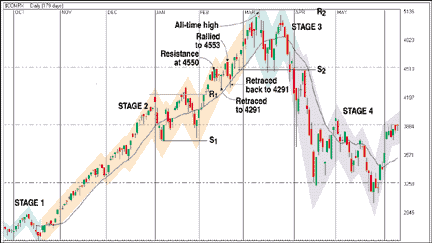
FIGURE 1: NASDAQ COMPOSITE. The tech-heavy Nasdaq enjoyed a great bull rally from mid-October 1999 to March 2000. Can you see any signs here that it was coming to an end?
When the bull ride came to an end, investors and traders witnessed one of the largest drops ever experienced by the tech-heavy Nasdaq. A market once dominated by pure greed became dominated by fear. Some traders received unthinkable -- and unmanageable -- margin calls, while those who had tentatively tested the waters in the markets learned their lessons during that period the hard way. In short, what was once considered a roaring bull market had hit that inevitable ceiling and started on its downward slide.
When everything looks so rosy, it's easy to lose sight of the underlying features that drive the market. Now, of course, after the damage has been done and the pieces of the crash have been picked up, a quick look at Figure 1 should reveal where you could have avoided the sharp trend reversal to protect your profits. What clues could you have picked up as the market was unfolding that would have alerted you to close out all your long positions and avoid those disastrous negative returns on your portfolio?
THE FOUR STAGES
Markets generally go through four stages. Figure 2 identifies the four stages of the typical cycle that the market follows. The first stage is one of very little activity, with prices remaining relatively flat. The second stage begins when prices break out of this range. Ideally, this is where you should enter a long position and hold onto it. The third stage comes when prices reach a peak and start leveling off. After leveling off, they eventually start declining, which is the beginning of the fourth stage.
Generally, I use the 15-day moving average of the closing prices to help determine the direction of the trend and identify the various stages. When the 15-day moving average starts sloping upward and prices rise above it, that indicates that the market is entering its second stage. As long as the moving average continues to slope up, the trend is still moving in the positive direction. Once it starts flattening, however, that indicates that the trend is coming to a halt. When it changes direction and starts down, the trend is reversing.
Jayanthi Gopalakrishnan is a Staff Writer for STOCKS & COMMODITIES.
Excerpted from an article originally published in the August 2000 issue of Technical Analysis of STOCKS & COMMODITIES magazine. All rights reserved. © Copyright 2000, Technical Analysis, Inc.
Return to August 2000 Contents