CLASSIC TECHNIQUES
It's Been Around Forever, And It Still Works
Classic Point And Figure
by David Vomund
It was around before computers; it was around before calculators. It's been around forever, and despite that, it still works. It's point and figure charting, and it still offers unique advantages. Here are some examples.
Most people use bar charts or candlestick charts in their analysis. Another charting form, point and figure, is less known but offers unique advantages over the more traditional charting methods. The point and figure charting technique became popular in 1948, when A.W. Cohen published his book on point and figure. Surprisingly, the methodology has hardly changed since then.

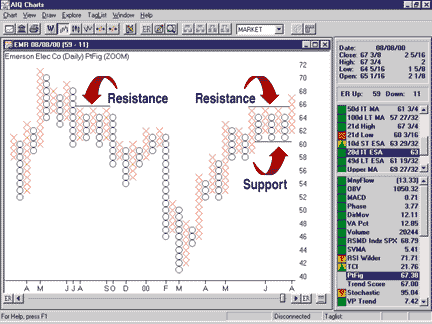
FIGURE 1: EMERSON ELECTRIC. Prices break a resistance level in EMR. Prices at which the Xs and Os stop are your resistance and support levels.
Unlike bar charts, where the vertical coordinate is based on price and
the horizontal coordinate is based on time, point and figure charts are
only concerned with price. Although the year and months are reported on
the horizontal axis, they are shown merely to establish a frame of reference.
Since time is not a factor, small fluctuations in price are often not charted. Without these disturbances, it is easier to spot critical support and resistance levels. It is also easier to visually locate chart patterns.
Point and figure charts are plotted with Xs and Os. Vertical columns of Xs represent increasing prices, while the Os represent decreasing prices. Each X or O represents a specific increment of change in price, which is referred to as the box size.
For example, each X may represent a $2 increase in the price of the stock. Every time the stock price increases by $2, an X is plotted. Time is irrelevant, so it doesn't matter how long it takes for the security to make the $2 advance. If I am plotting Xs, I know the stock is advancing.
Most analysts use a three-box reversal, which means a stock must fall by three times the box size before a new column of Os will appear to indicate a trend reversal. In our example of a $2 box size, a stock must fall by $6 (three times $2) before a new column of Os is plotted. The three-box reversal eliminates all minor and sometimes confusing fluctuations.
As with log-scale charting, there are different box sizes depending on the stock price. Normally, each box for a stock between $20 and $100 represents a $1 move. If the stock is between $5 and $20, then each box represents a $0.50 move.
These box sizes work fine, but I find that larger box sizes are more appropriate in today's volatile market. This is especially true with Nasdaq growth stocks. I've doubled the recommended box sizes so that a stock between $20 and $100 has a $2 box size and a stock between $100 and $500 has an $8 box size. With the larger box sizes, the reversal areas represent more significant support and resistance levels.
It is helpful to understand the mechanics of point and figure charting, but it is not critical. I use AIQ's TradingExpert to take care of the construction of the charts, which allows me to concentrate on their interpretation. Luckily, it is much easier to interpret the charts than it is to understand their construction.
David Vomund is the chief analyst at AIQ Systems, the leading developer of artificial intelligence-based charting and analysis software. Vomund is also president of Vomund Investment Services, which publishes the weekly VIS Alert.com newsletter. He is a regular guest on financial news programs in Los Angeles and Chicago. He can be reached via E-mail at dvomund@visalert.com.
Excerpted from an article originally published in the December 2000 issue of Technical Analysis of STOCKS & COMMODITIES magazine. All rights reserved. © Copyright 2000, Technical Analysis, Inc.
Return to December 2000 Contents