NEW TECHNIQUES
A Modern Approach To Technical Indicator Visualization
Traditional technical indicators tend to provide a narrow view of the market. This technique can give you a broader one and help you select an indicator lookback period.
Here’s to technology in the 21st century! Computer hardware is fast and plentiful, with GPU graphics processors in our tablets and smartphones, and now, we can catch up with visualization improvements in our technical indicators. The SwamiCharts data visualization technique is a mosaic of technical indicator readings at multiple lookback periods, with each reading pieced together into a heatmap chart. This technique retains the core functionality of the technical indicators you are already familiar with while condensing more information into an easy-to-interpret heatmap.
In this, the first of several articles, we introduce SwamiCharts as a better way to visualize technical indicators in a big-picture context. We illustrate why the narrow scope offered by traditional indicators can result in a myopic view and how SwamiCharts solves this issue.
What’s a good lookback period?
When J. Welles Wilder introduced the relative strength index (RSI) in the late 1970s, a number of early technicians questioned why he used a 14-day lookback period. This led one of these authors of this article, John Ehlers, to a decades-long quest for the “correct” lookback period and spawned the idea for his MESA cycles-measuring program.
MESA enables indicator lookback periods to be adaptive to measured market conditions. Alternative techniques have been suggested, but each has inherent limitations:
Traditional indicators give you details, but what does it mean? For example, a chart of the RSI shows you precisely when the indicator crosses over 80, but does this occurrence always indicate the same thing? SwamiCharts offer a tradeoff for a better visualization — a wider view of the indicator’s true meaning. In addition, SwamiCharts provide a solution in the choice of lookback period. And of course, you can always continue to plot your old favorite classic indicator alongside a SwamiCharts version if you so choose.

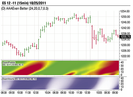
FIGURE 1: VOLUME LEADING PRICE. Here you see the 15-minute chart of the emini S&P 500 contract with the Swami Predict and Swami Volume indicators. The changes in color make it easy to understand the price/volume relationship.