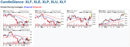
FIGURE 1: STOCKCHARTS CANDLEGLANCE. Here you get to see the charts of the various market sectors giving you a good overview of the entire market.
TRADING TICKET
We have seen our fair share of volatile markets over the past few years. Just when we thought the markets were gearing up for a nice rally, the economic problems in the eurozone sent them back to that same volatile behavior. Even though in times of economic crisis all sectors tend to follow the broader markets, there are some such as consumer staples, health care, and utilities that are considered safe havens. Then, just as the markets start to recover, sectors such as financials, consumer discretionary, and industrials tend to outperform.
In Giorgos E. Siligardos’ article this issue, “Applying The Sector Rotation Model,” the author states that the outperformance of energy, consumer staples, health care, and utilities warn of possible trouble in the broader markets, whereas the outperformance of financials and consumer discretionary sectors indicate a stock market flush.
In addition, Siligardos also suggests two sites where you can keep track of the performance of the various sectors. Let us take a look at these as our first step in analyzing sectors. The sector charts available at StockCharts.com (see end of this article) gives you a picture of the various Select Sector SPDRs. I chose the charts of the five sectors mentioned in the article using the Select Sector SPDR funds, XLF, XLY, XLE, XLP, and XLU.
It may be difficult to see clearly, but in Figure 1 there are five small charts representing each of these sector exchange traded funds (ETFs) with the 20- and 50-period simple moving average (SMA) overlaid on them. On June 14, 2012, XLP and XLU were outperforming. This tells us that we are still in a bearish market: no surprise there.

FIGURE 1: STOCKCHARTS CANDLEGLANCE. Here you get to see the charts of the various market sectors giving you a good overview of the entire market.